Layout: 3-stĺpce
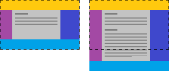
Pevná šírka bočných stĺpcov
V nasledujúcom článku si ukážeme, ako vytvoriť trojstĺpcové rozloženie stránky, pri ktorom majú bočné stĺpce nastavenú pevnú šírku a stredný vypĺňa zvyšný priestor.
HTML štruktúra
Stránku rozčleníme na pätu (#footer) a obalovač zbytku obsahu (#wrapper):
<html>
  <body>
    <div id="wrapper" class="clearfix">
      <div id="header">…</div>
      <div id="menu">…</div>
      <div id="side">…</div>
      <div id="content">…</div>
    </div>
    <div id="footer">…</div>
  </body>
</html>
CSS
Pomocou CSS je dôležité nastaviť:
html, body {
  height: 100%;
  margin: 0;
}

#wrapper {
  min-height: 100%;
  margin: 0 auto -50px; /* negative of #footer.height */
  position: relative;
  /* uncomment following line to set fixed width */
  /* width: 1200px; */

}

#header {
  background: Orange;
}

#menu,
#menu:before {
  width: 225px;
}

#menu {
  float: left;
}

#menu:before {
  background: DarkMagenta;
  content: '';
  position: absolute;
  top: 0;
  bottom: 0;
  left: 0;
  z-index: -1;
}

#content {
  margin-left: 225px; /* same as #menu.width */
  margin-right: 175px; /* same as #side.width */
}

#content:before {
  background: LightGray;
  content: '';
  position: absolute;
  top: 0;
  bottom: 0;
  left: 225px; /* same as #menu.width */
  right: 175px; /* same as #side.width */
  z-index: -1;
}

#side,
#side:before {
  width: 175px;
}

#side {
  float: right;
}

#side:before {
  background: palegreen;
  content: '';
  position: absolute;
  top: 0;
  bottom: 0;
  right: 0;
  z-index: -1;
}

#footer, #container:after {
  height: 50px;
}

#footer {
  background: SteelBlue;
}

.clearfix:after {
  display: block;
  content: " ";
  clear: both;
}
Princíp
Uvedený spôsob využíva nasledujúce princípy:
Príklad
Demo si môžete pozrieť tu.
Zdroje
- StackOverflow: Display footer in PrimeFaces template, when fullPage of p:layout is set to false (26. november 2015).
- Kezz Bracey: Quick Tip: Solving the Equal Height Column Conundrum (26. november 2015).
- Matt Boldt: Using 100% Height in CSS (26. november 2015).